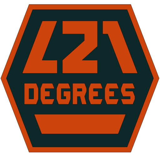
It’s a shield, showing “L21” in big bold letters and “DEGREES” in a custom font. Very geometric, almost mechanical, all angles measure 21° or a variation of it. The colors (which are still in the air) are burnt orange and misted black, bonus points to whoever recognizes the paint palette this is coming from.
Inspiration for the shield comes from the knights in medieval times, full armor, swords and shields. The shape comes from the honeycomb pattern, who doesn’t like those hexagons nested neatly defying most manufacturing processes? Of course, I added my spin where the side angles measure 21 degrees but still fit an inscribed circle tangent to all sides.
The “L21” was initially going to be a huge “L” behind the number “21” but as I sketched the letters, I decided to do the number “1” in a mirrored angle and bam! Bonus for that nostalgic feel coming from a galaxy far, far away…
“Degrees” almost didn’t make it in there but as the “L21” took that shape, it couldn’t be centered vertically anymore so I needed some bottom filler but also didn’t want to use an existing font and wanted something I could control 100% so I designed a parametric template for the font where the letters became a result of connecting dots where needed. The following shape is just filler for now.
If you were expecting some deeper meaning… sorry, I’m working on that 🙂
All said, here it is!